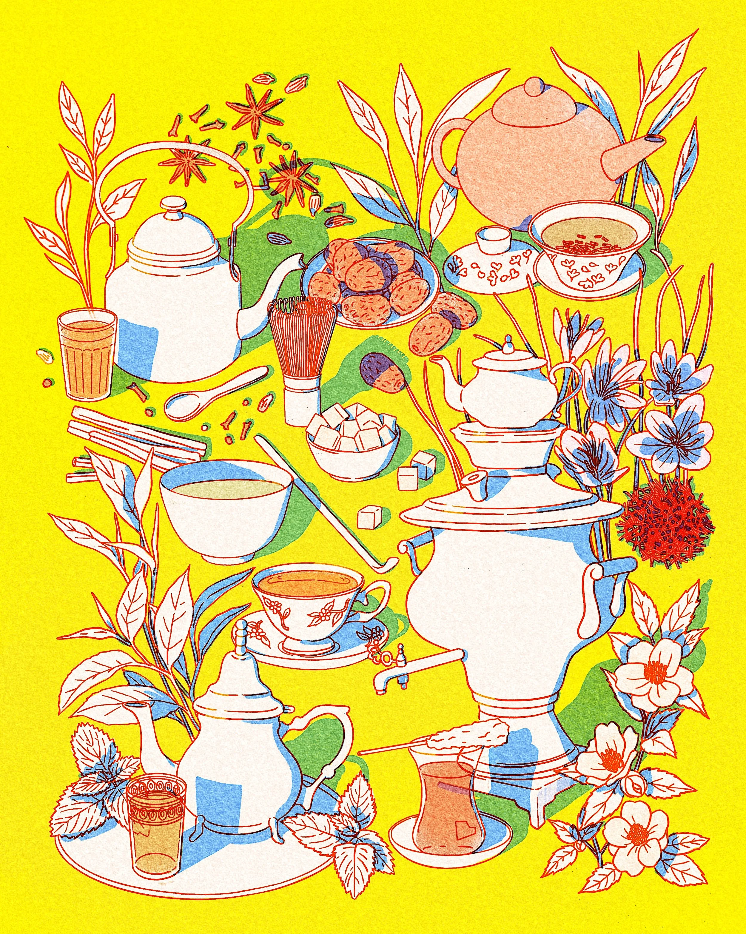
An illustration celebrating tea culture from around the world, featuring traditional teas, ingredients, and tea ware from China, Iran, Japan, India, and Morocco. The color palette is inspired by the vibrant textures of risograph prints.
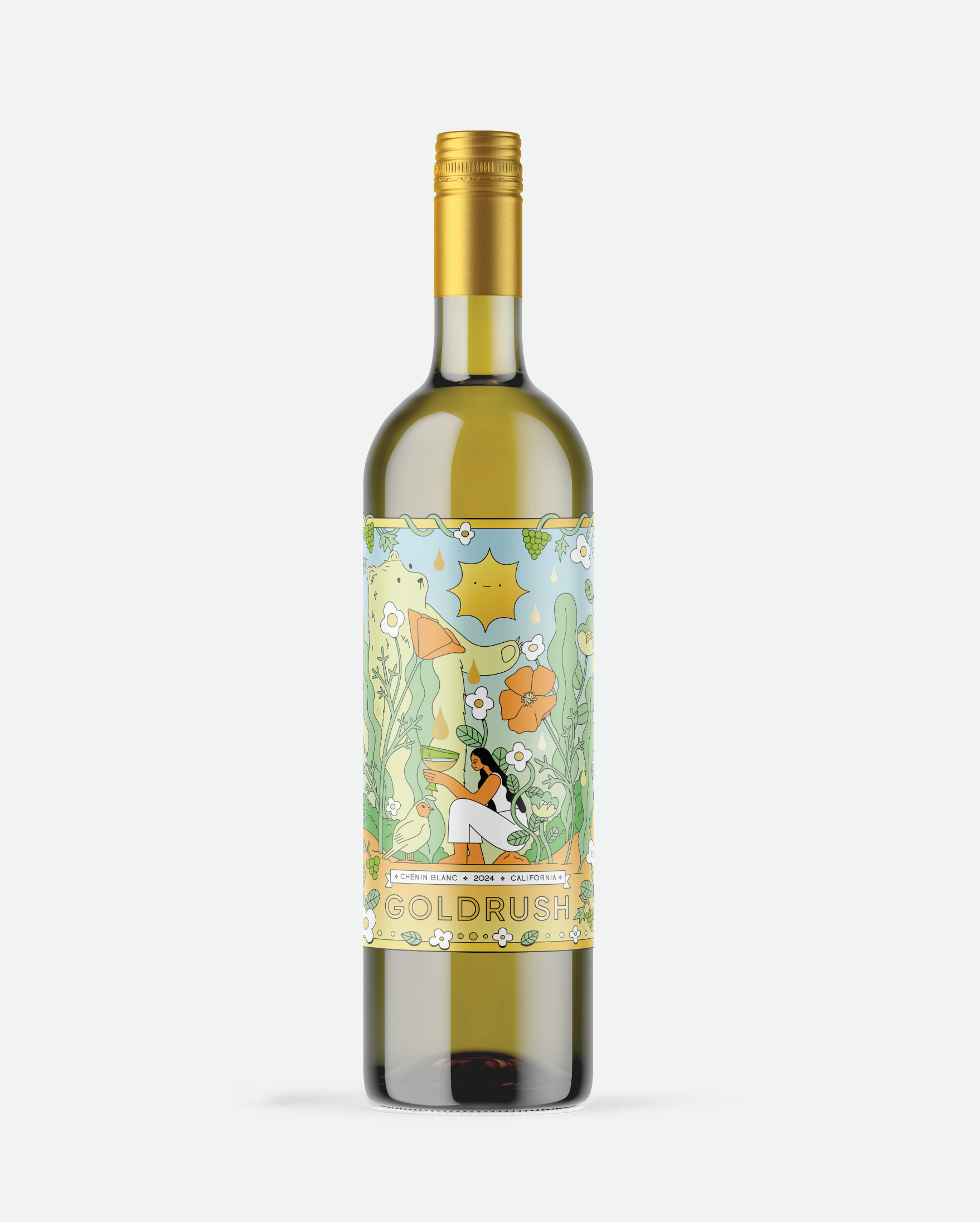
This project is a label design for a Napa Valley Chenin Blanc, commissioned by Wine52, a UK-based wine discovery club. I was given full creative freedom to explore a California-based concept, which led me to focus on the state’s natural landscape.
The illustration is built around a central figure holding a wine glass, surrounded by elements that reference California’s natural symbolism.
I titled the wine Goldrush to connect the concept back to California’s history and proposed using gold foil to carry that idea through the material itself. The gold detailing, used in the frame and dropplets throughout the illustration, adds a luminous and elixir-like feel to the wine.
The bottle is available through Wine52.
A selection of illustrations I created for MongoDB, featuring technical and product visuals used across webpages, conference presentations, and educational materials.
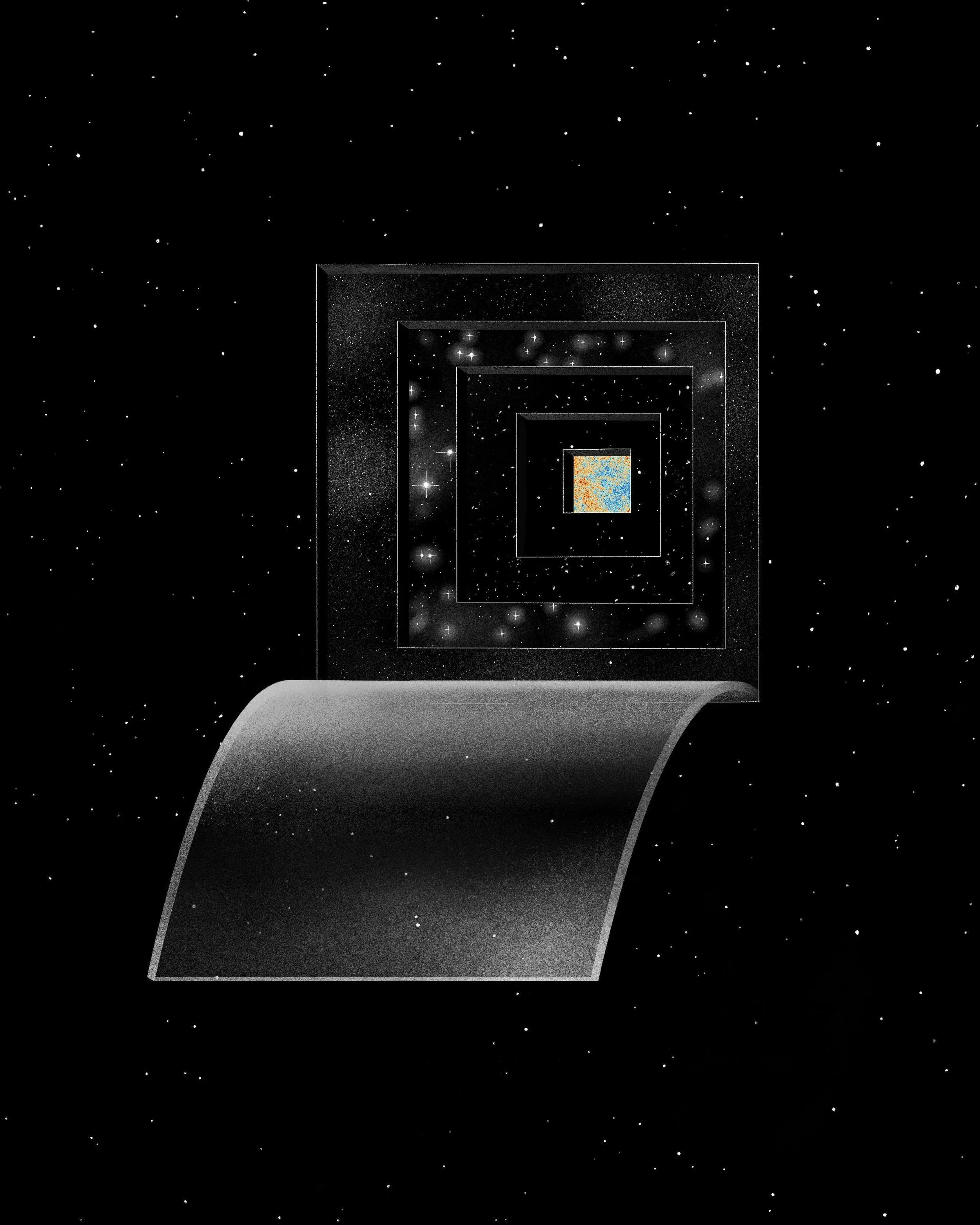
This illustration was inspired by a passage from The Three-Body Problem by Liu Cixin. I wanted to depict the depth of the universe by peeling away layers, from galaxies all the way to the cosmic microwave background. The universe isn’t hiding anything from us; it’s too vast for us to comprehend. And even as we strip back each layer, we find ourselves with more mystery.
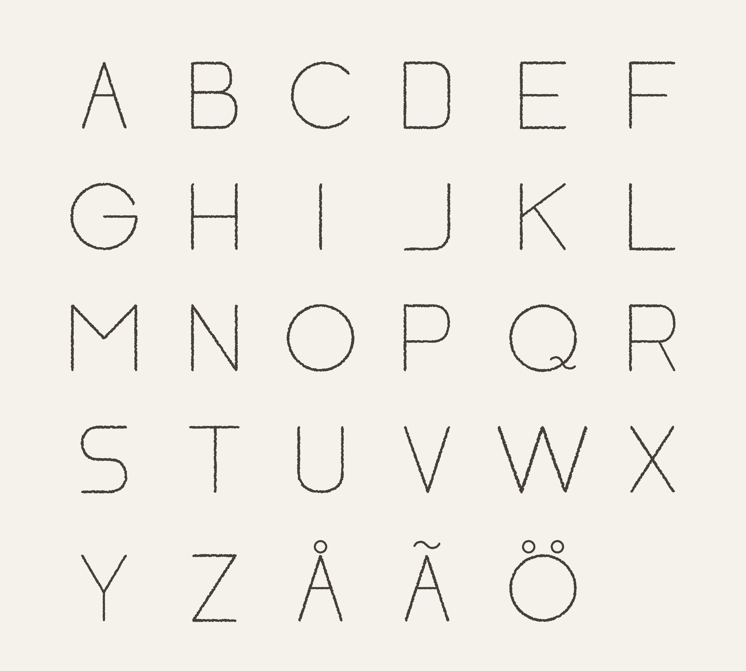
This project began as a practical need within my illustration work and has gradually evolved into a personal typeface, which is still in development as a fully usable font.
When I include text in my illustrations, I want the typography to feel integrated with the hand-drawn linework rather than existing as a separate element.
This led me to develop my “digital handwriting,” which is based on how I naturally write in all caps.
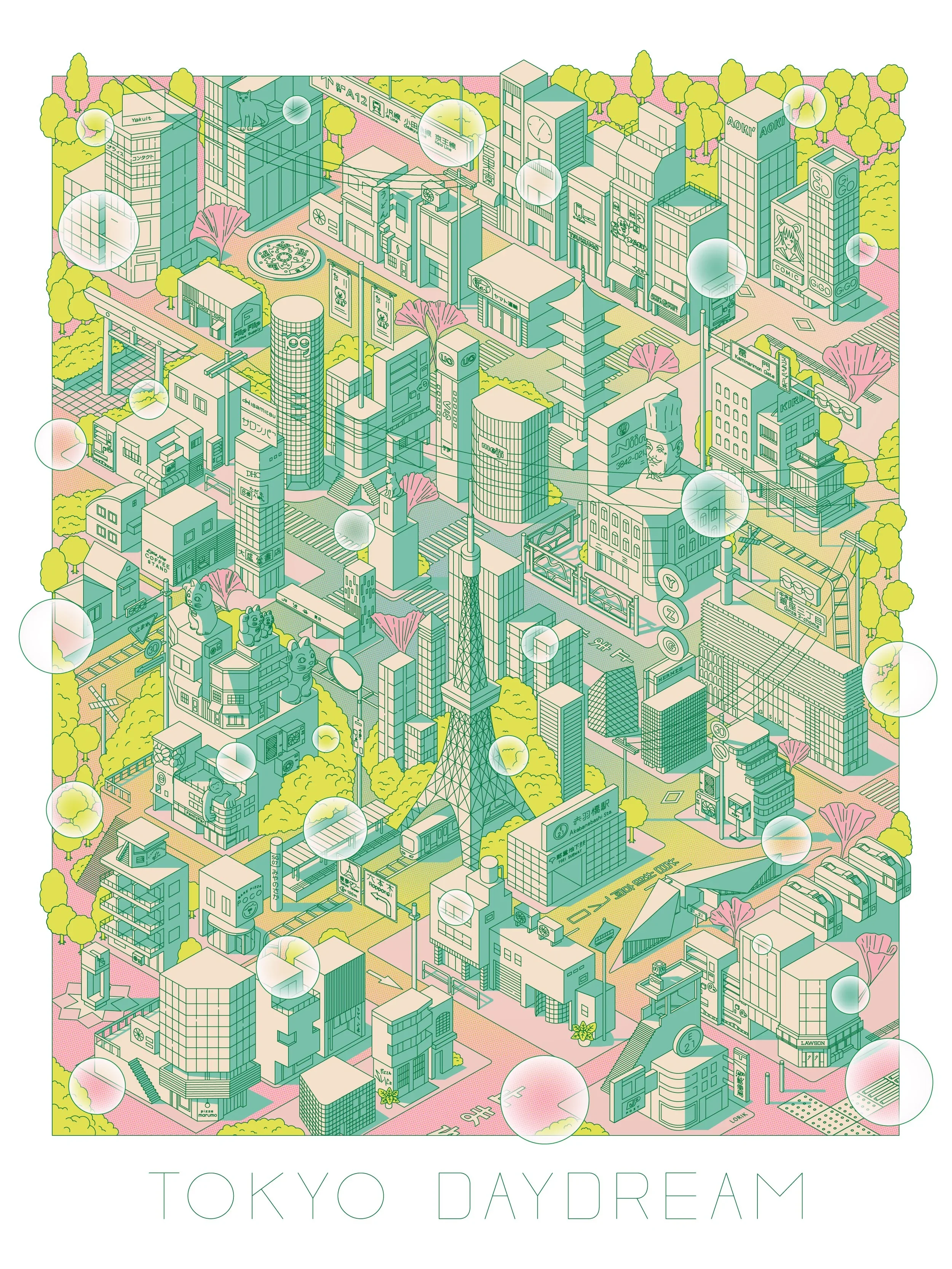
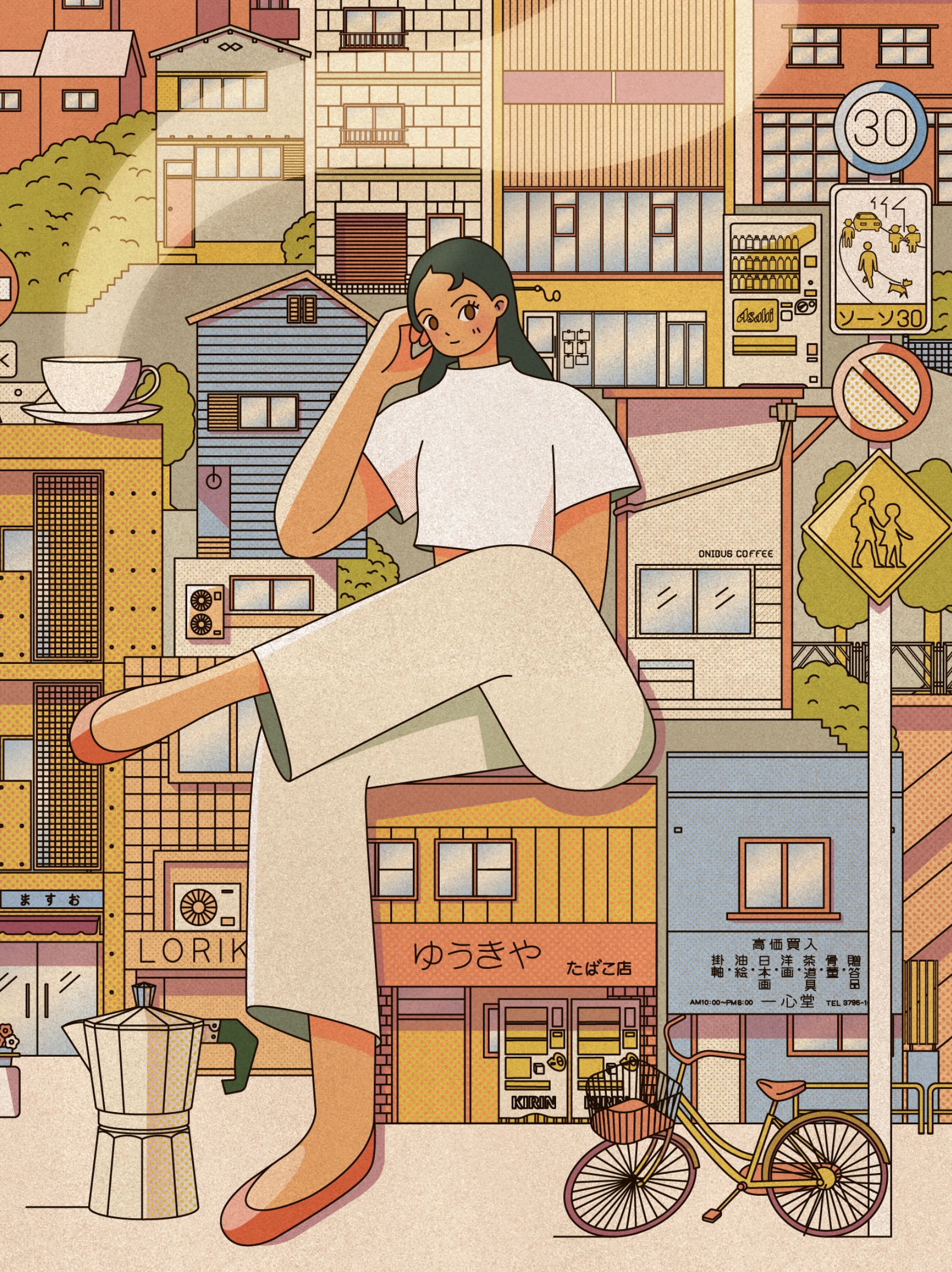
Tokyo Daydream is an illustrated map of Tokyo, created as a personal response to a place I really fell in love with.
Instead of trying to represent the city accurately, I focused on bringing together everything I was drawn to: the neighborhoods, small details, and moments that stayed with me, and then placing them into a single frame.
The color palette is inspired by 90s anime, especially the cityscape backgrounds from Sailor Moon. I wanted the illustration to feel alive and a little dreamy, like a collection of memories sitting together in one place.
**The typeface used for the “Tokyo Daydream” title was also designed by me.
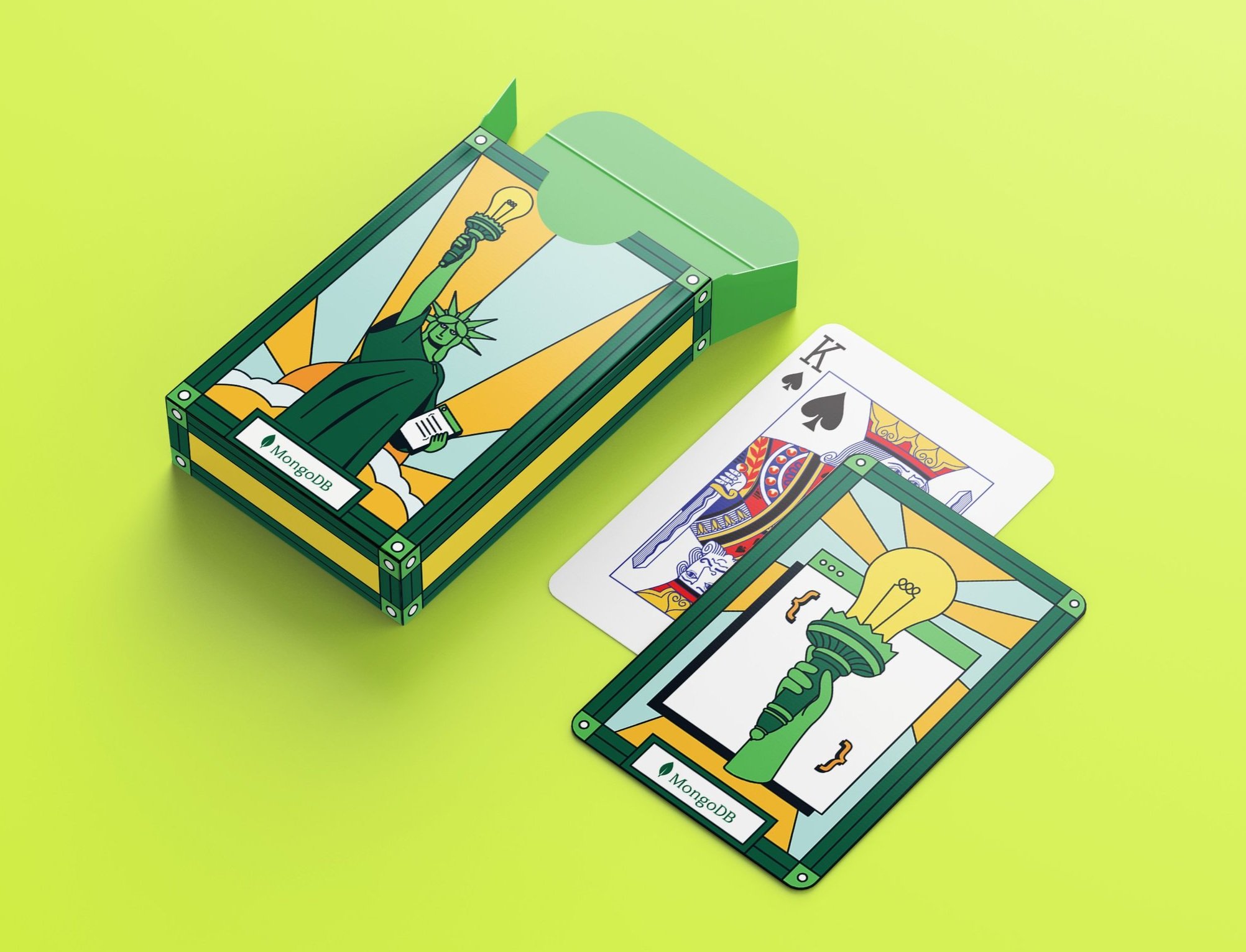
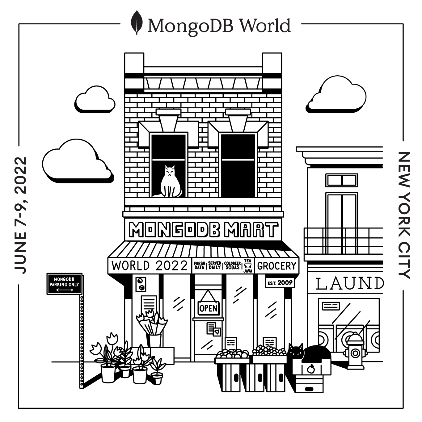
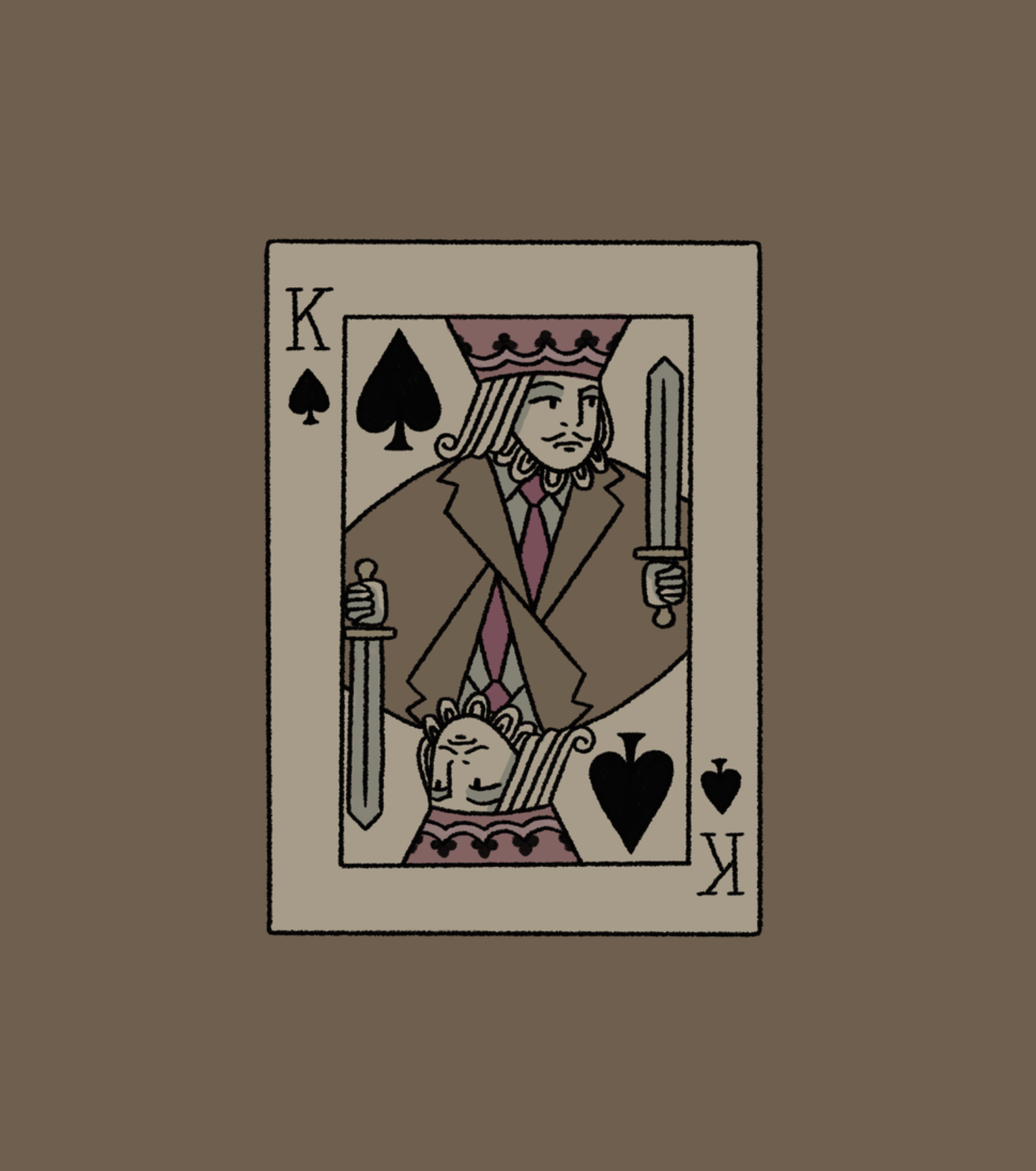
I was responsible for the concept and design of a deck of cards used as swag for the MongoDB World 2022 tech conference. The conference was held in New York City, so I illustrated the Statue of Liberty, enlightening the world, touching on the NYC theme, and mirroring MongoDB, lighting the way with their innovative products.
I created this set of illustrations for a Los Angeles Times article about the California wildfires that devastated homes in Altadena and the Pacific Palisades.
The Times invited readers to share personal stories about what they lost and how they felt through an online form. The responses were then organized according to the different emotions people expressed. My illustrations depict some of the cherished belongings people lost in the fires.
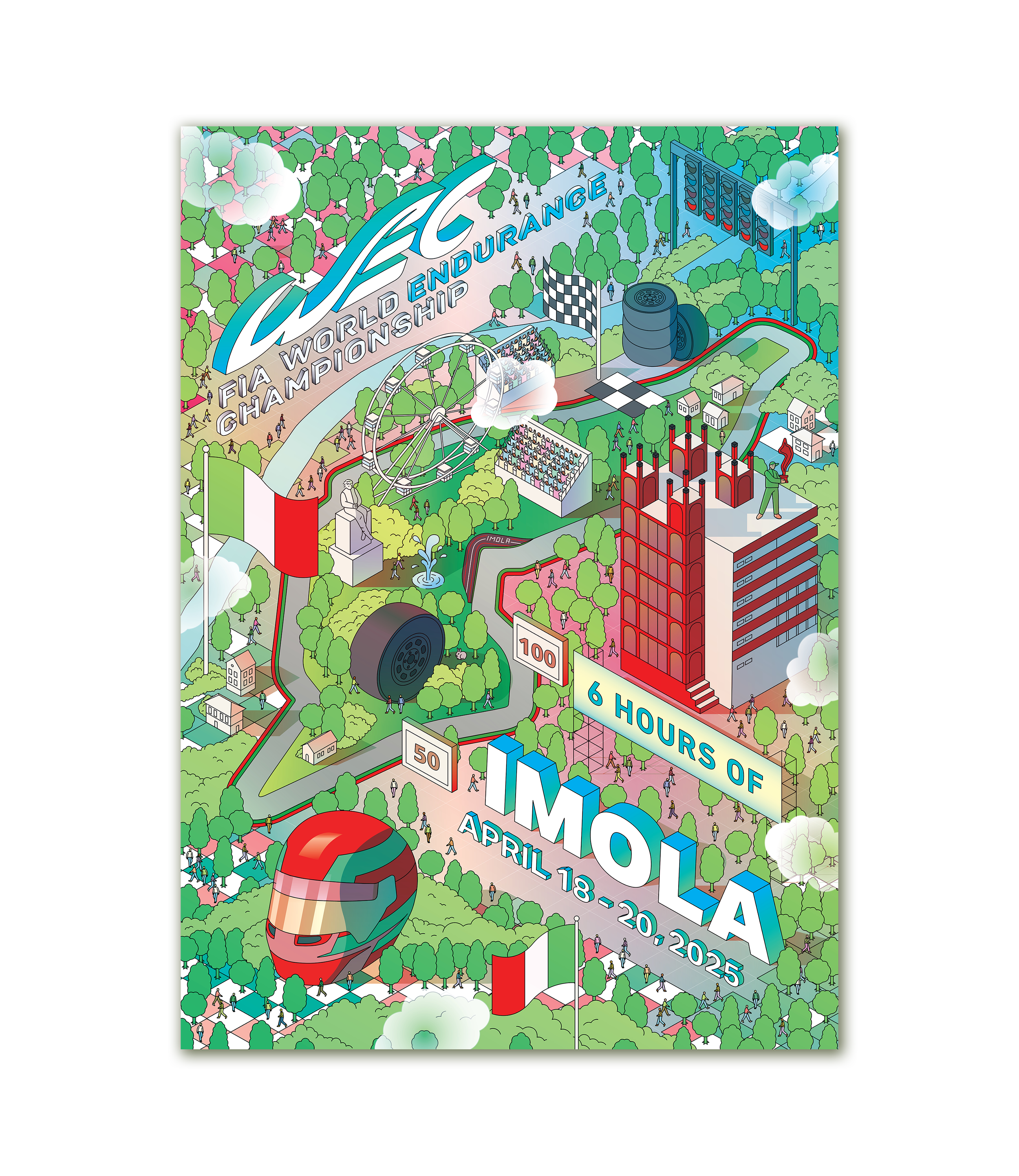
Automobilist approached me to create a limited-edition poster for the FIA World Endurance Championship’s 6 Hours of Imola race in Italy. The illustration debuted at the April 2025 event and is now available through Automobilist’s website as part of their official WEC collection.
I illustrated an isometric view of the Imola circuit, filled with iconic landmarks and F1-inspired details. I included subtle nods to this historic track, including the red, white, and green curbs, the Ayrton Senna statue, and the iconic architectural landmarks. There are several Easter eggs throughout the piece for fans to discover.
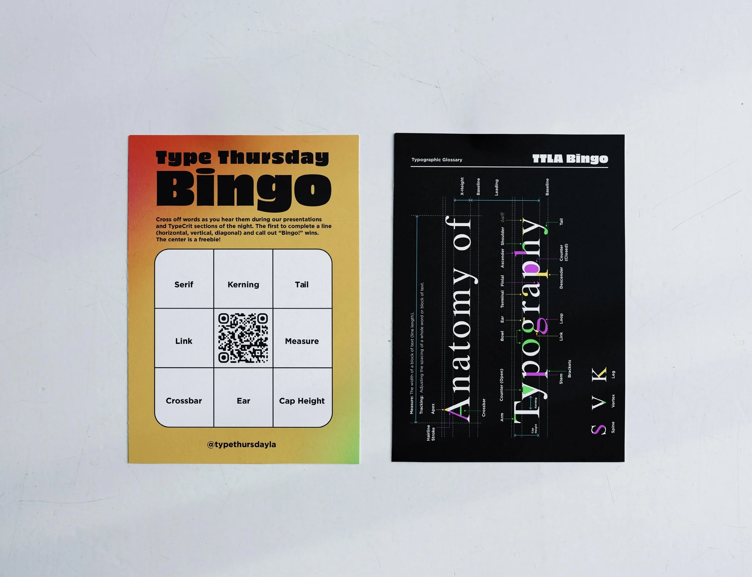
I designed these Type Bingo cards for Type Thursday Los Angeles, where they’re used as an interactive activity during presentations. As typography-related terms come up throughout each talk, participants can mark them off on their cards as they play along.
To make the cards useful beyond the event, I included a typographic anatomy diagram on the back so they could also function as a small educational takeaway.
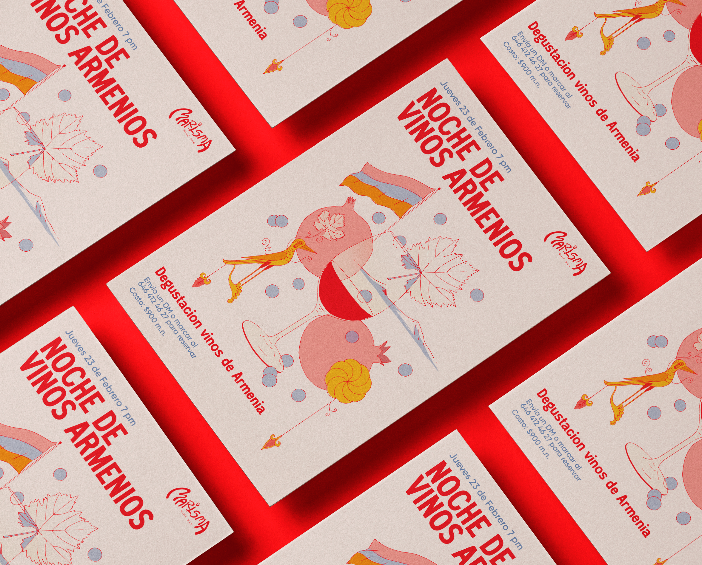
Marisma Wine Bar is a thoughtfully curated wine bar located in Ensenada, Baja California. They regularly host tasting events that celebrate wines from around the world.
To celebrate their Armenian wine tasting event, I designed a poster that incorporates symbolic elements of Armenia. In addition to the poster, I developed complementary assets for Marisma’s social media, including Instagram posts, to help promote the event.
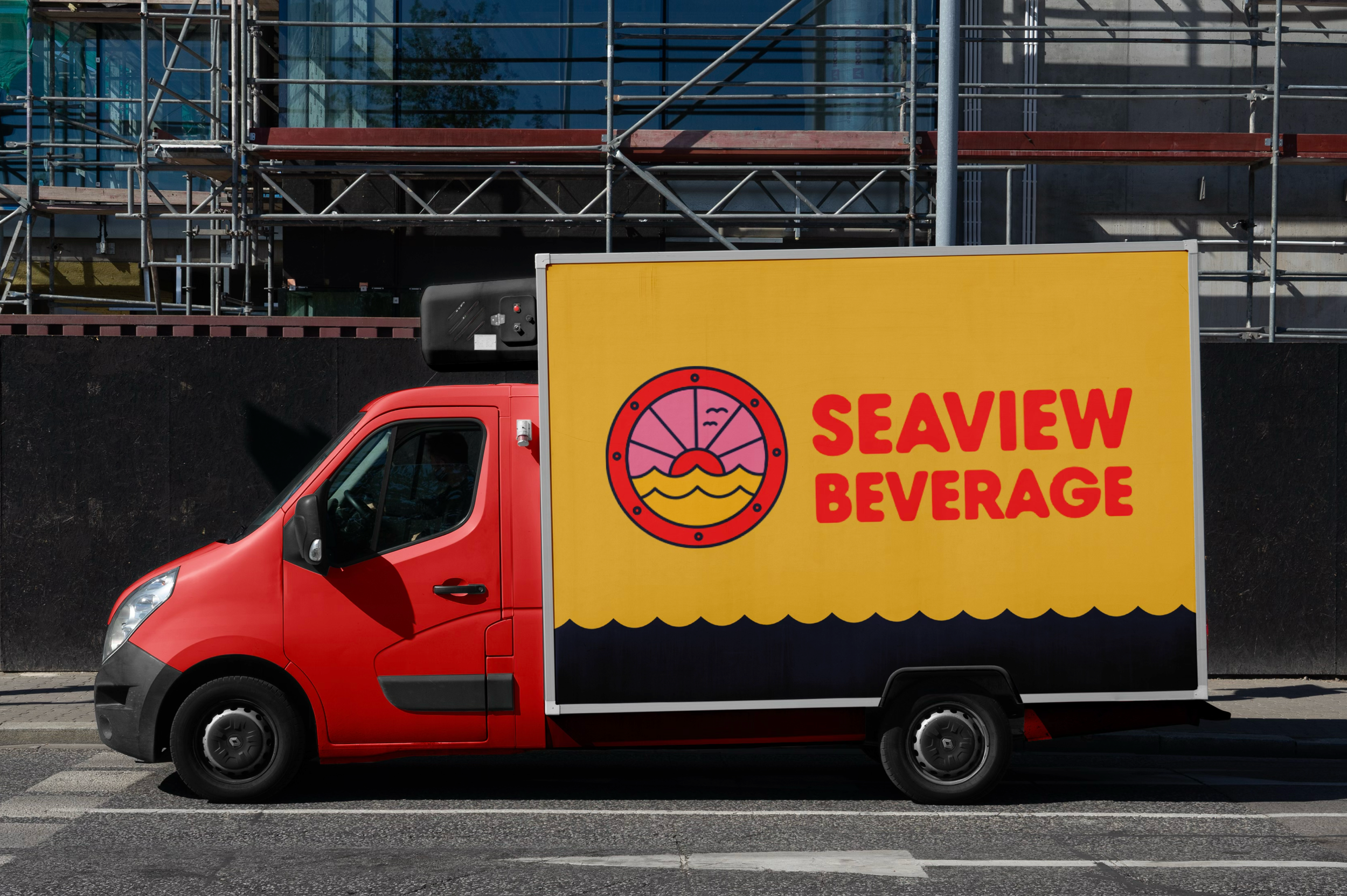
Seaview Beverage is a family-owned, non-alcoholic beverage distribution company serving Ocean and Monmouth Counties in New Jersey.
In a largely corporate industry, Seaview Beverage emphasizes a more personal approach to its clients and products. This is reflected visually through a family-friendly design, using bright colors to create an inviting and approachable tone.
The logo draws from a boat window that has been part of the owner’s family for years. Incorporating this detail allowed the identity to reflect something personal and familiar, tying the brand more closely to its roots and story.
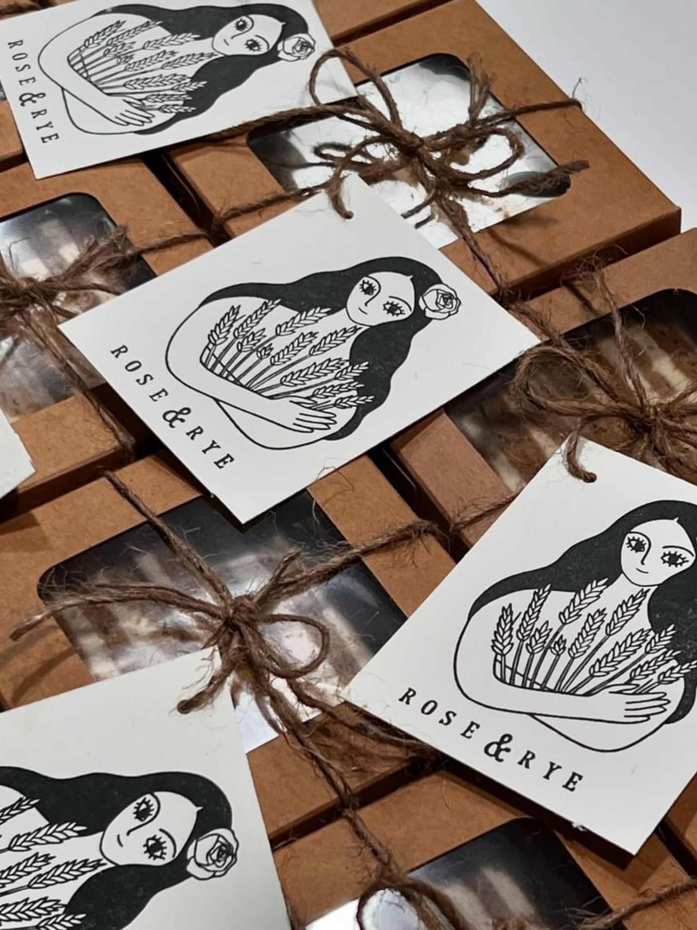
Rose & Rye is a diasporic Armenian bakery based in Southern California, offering cakes and pastries that feel both comforting and rooted in tradition.
The logo features a hand-drawn illustration of a woman gently embracing a sheaf of wheat
For the MongoDB World 2022 tech conference, I was tasked with creating a New York City-themed T-shirt design that incorporated MongoDB easter eggs within it. I chose to illustrate the adorable bodega cats of NYC, which are often found in neighborhood corner stores.
Attendees received a t-shirt screen printed on-site as conference swag.
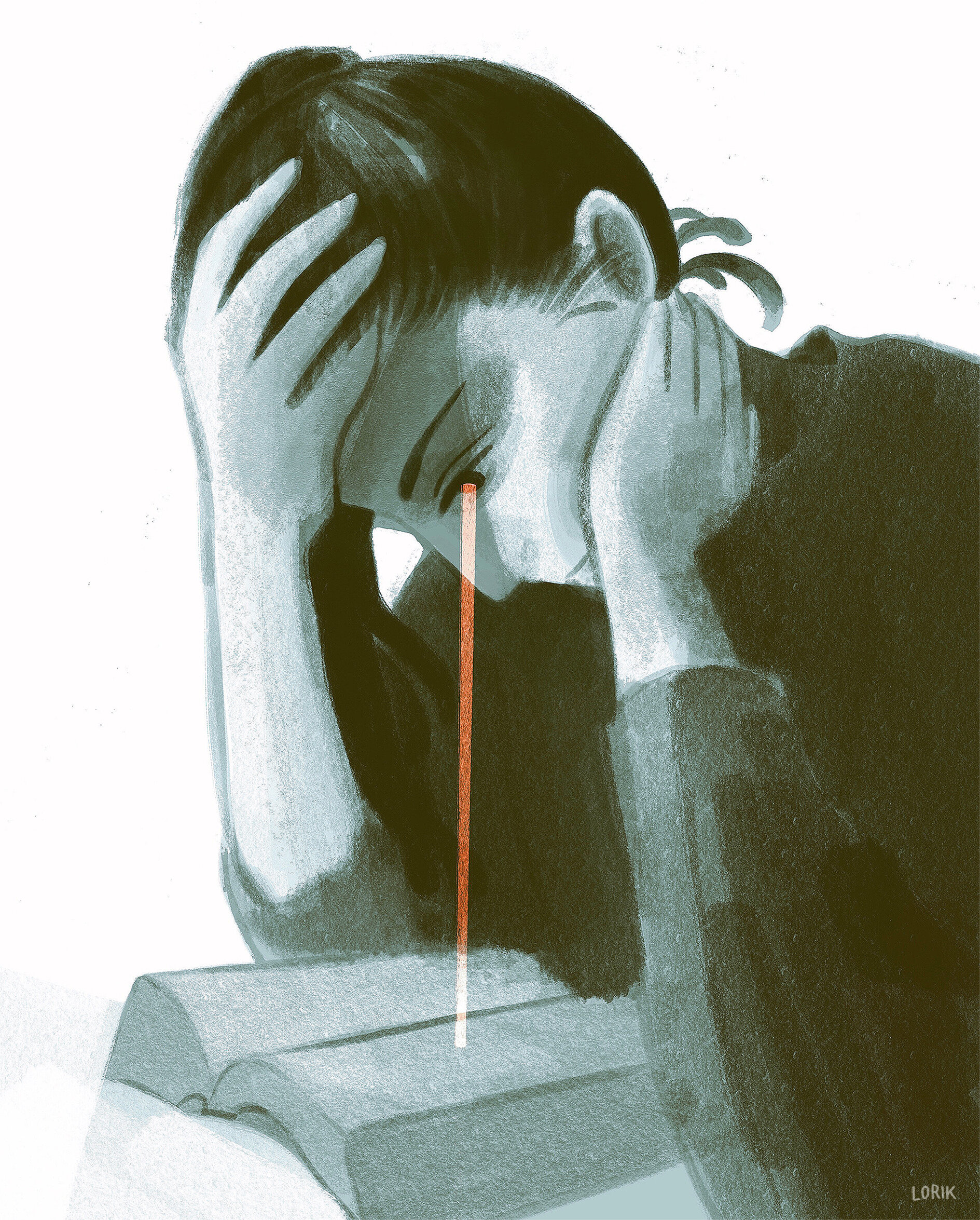
Learning to live with grief is an ongoing process.
I created this sling bag swag for MongoDB’s Engineering department for their successful launch of Serverless.
Embracing the theme of achievement, I drew inspiration from scouting badges to design a symbolic representation of this milestone.
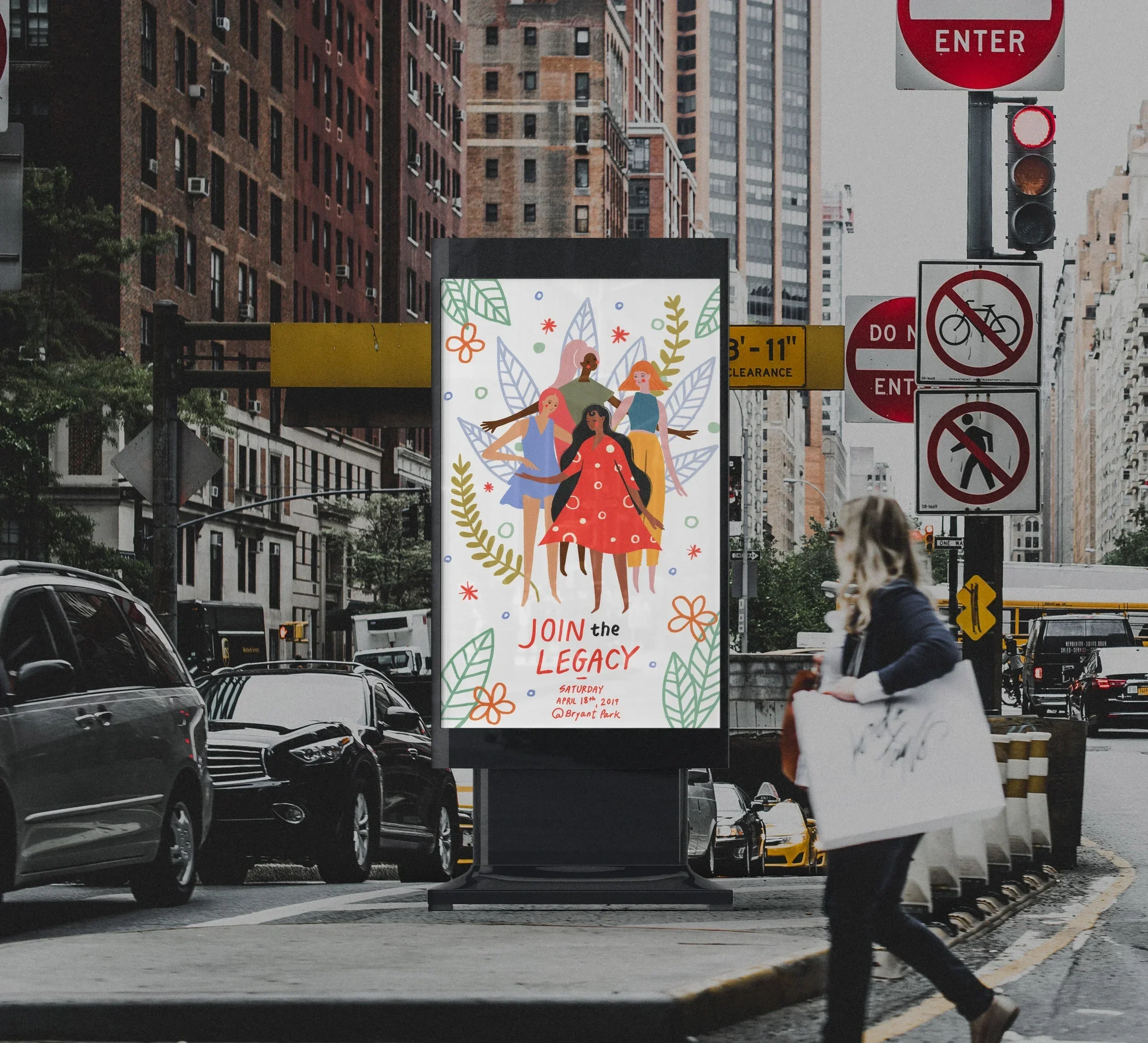
Join the Legacy is a conceptual campaign for a heritage cosmetics brand, centered around the idea that beauty is often something we learn from the people around us.
The project centers on the idea that beauty knowledge is often passed down through routines, rituals, and shared moments. Instead of focusing on a single age group, the campaign serves as a bridge, bringing together different generations.
To reflect that feeling, I used hand-drawn illustration and type to create a softer, more personal visual language. I wanted it to feel approachable, familiar, and something that could resonate with both younger and older audiences without feeling overly polished or distant.
Overall, the project explores how a legacy brand can evolve while still holding onto what makes it meaningful and becoming a more inclusive space where everyone is welcome.
Two illustrations created for GoFundMe’s Creators for Kindness campaign. Each piece explores a different expression of kindness: one through a mixtape, which I see as a small but meaningful act of love, and the other through care for our environment, highlighting the importance of clean drinking water and not taking it for granted.
I illustrated a banner for MongoDB’s brand and visual design department’s internal brand newsletter. Drawing inspiration from the iconic square and rectangular compositions of Piet Mondrian’s paintings, I incorporated a similar style to create a fun illustration, highlighting elements visual designers know and appreciate very well, such as the pen tool.
I created this set of iMessage stickers as a personal project, exploring expressive and playful ways of communicating through illustration. The stickers are designed to feel quick, relatable, and easy to use in everyday conversations.
The set has also been made available on Instagram and GIPHY, where it’s been widely used across stories and messages, reaching over 10.2 million views.
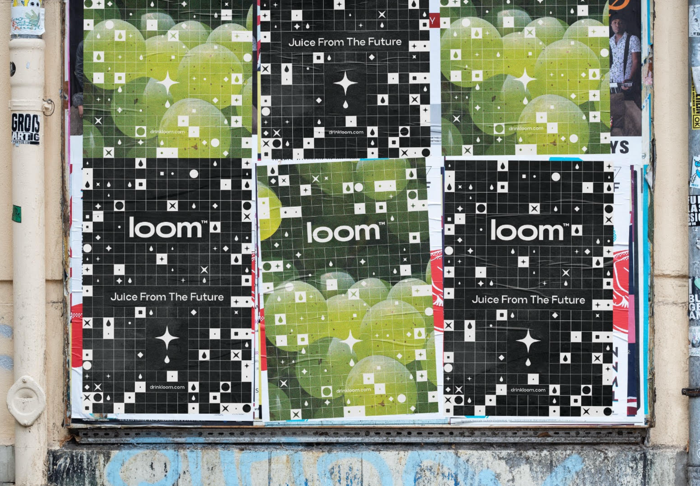
Loom is a beverage brand exploring a healthier alternative to traditional fruit juices. The concept is also built around the idea of an “ancient elixir,” refined, slightly unfamiliar, and otherworldly.
The identity is built on a grid-based system that allows for both flexibility and variation. From this framework, a modular set of tiles and symbols was developed to form a visual language that can shift across different applications.
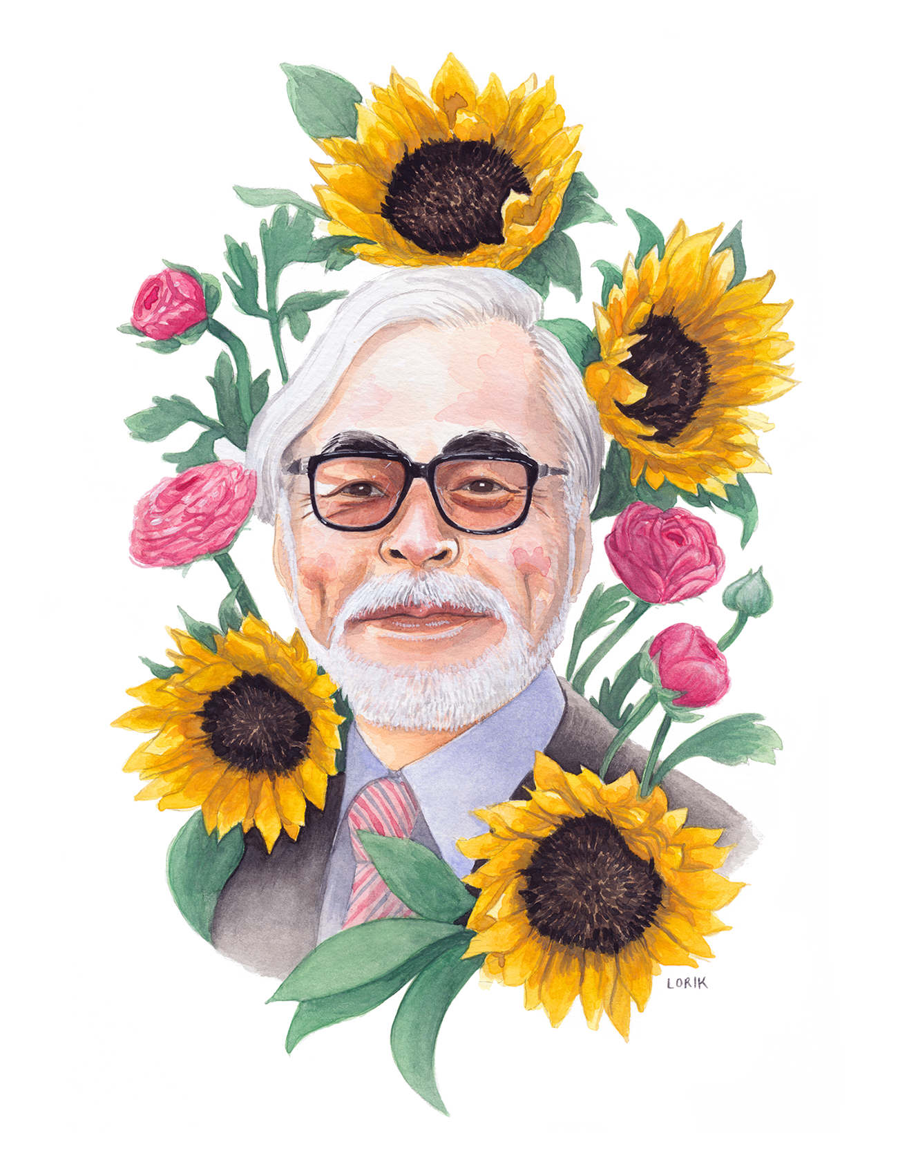
A collection of watercolor portraits I have painted of people I admire.
A challenge to create something everyday for the month of October.
MIA Design is a female-run VA and home automation studio based in Pasadena, California.
I worked with them to design and develop their website, focusing on creating a clean and zen-like experience that reflects their approach to design.
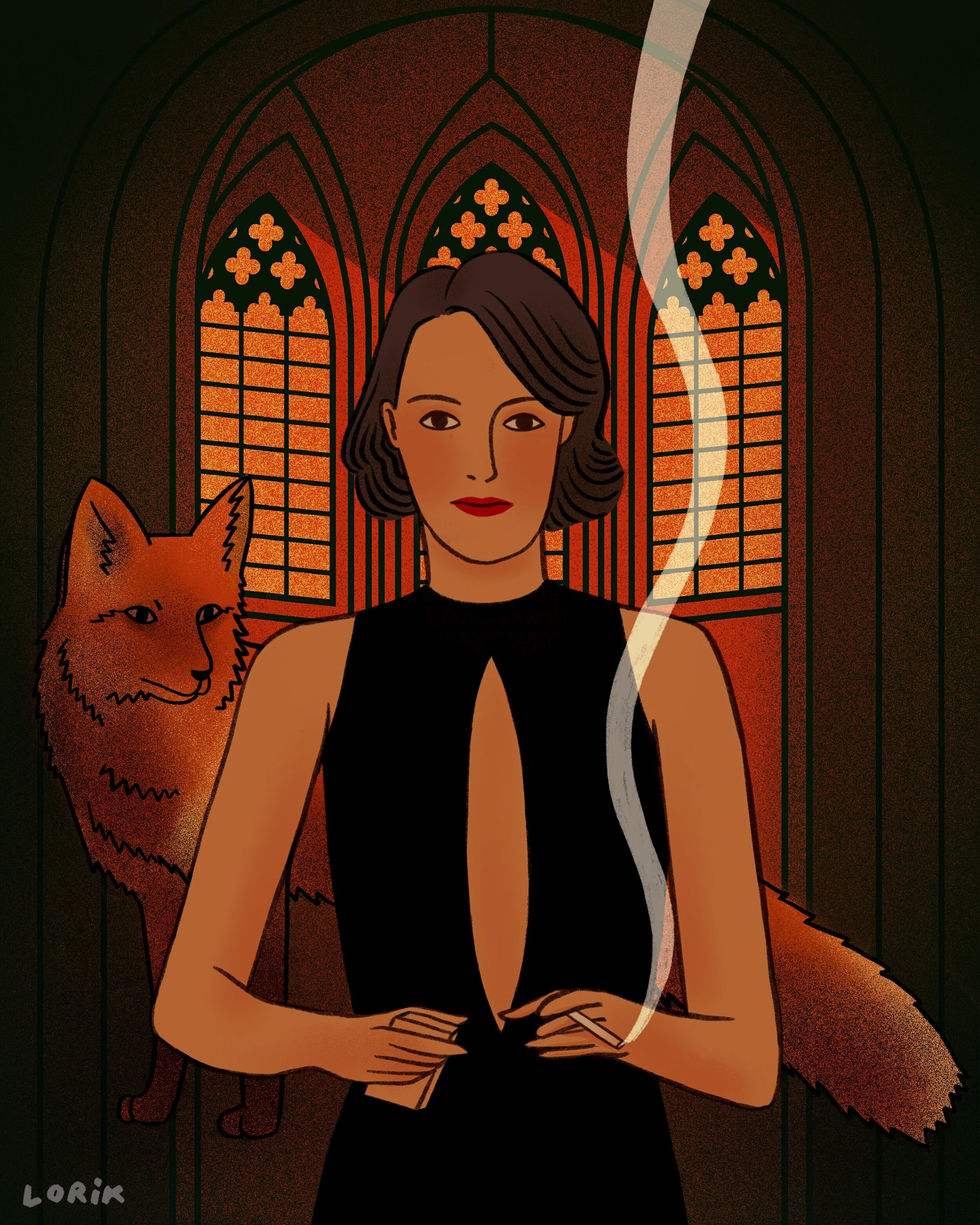
I fell in love with Fleabag and have played it in the background while working. Amazon Prime Video featured my illustration of the “Hot Priest” on their Instagram account.
A comic about a dream I had as a child about the local indoor pool facility that my family would frequent when we still lived in Hallsberg, Sweden.
This illustration was inspired by a book I'm reading called When We Cease to Understand the World, by Benjamin Labatut. The first chapter is called Prussian Blue, and it dives into the history of the first modern, artificially manufactured pigment. Starry Night by Van Gogh and The Great Wave by Hokusai are examples of artwork that made use of this dark blue pigment.
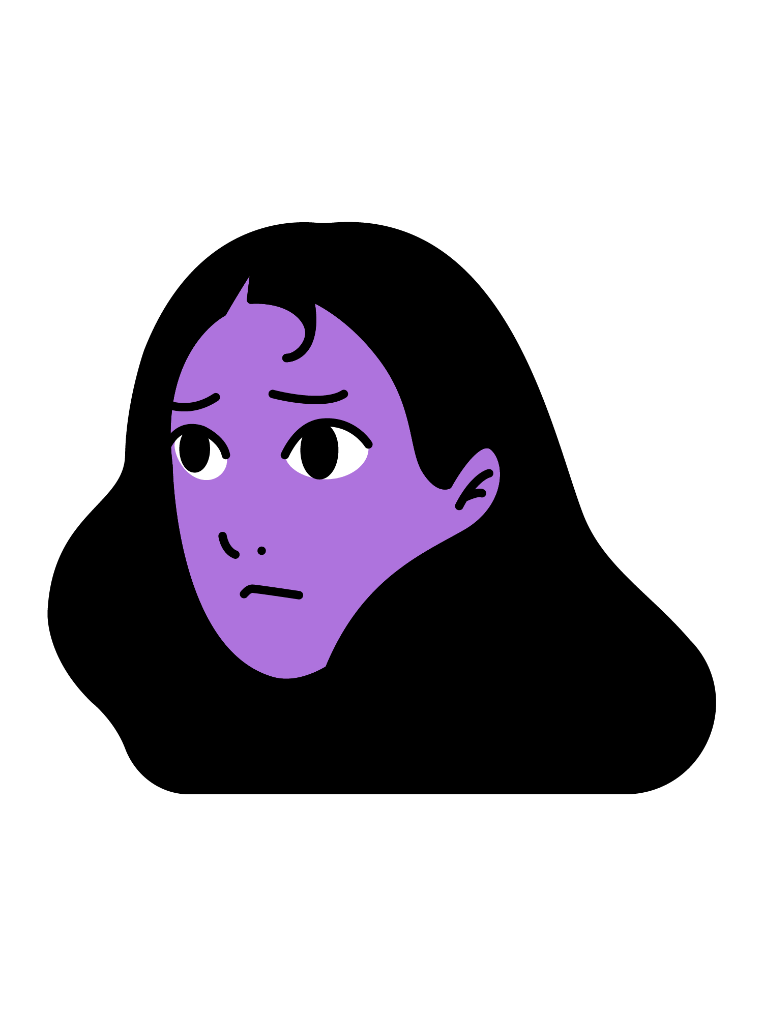
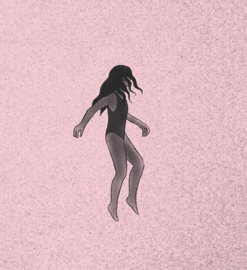
I created this personal branding project for myself in 2020. It was the first time I illustrated the long, black-haired girl, who has since become my signature character.
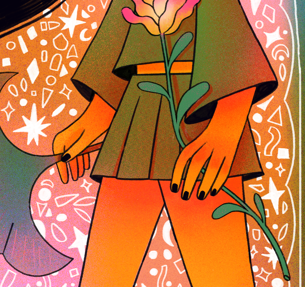
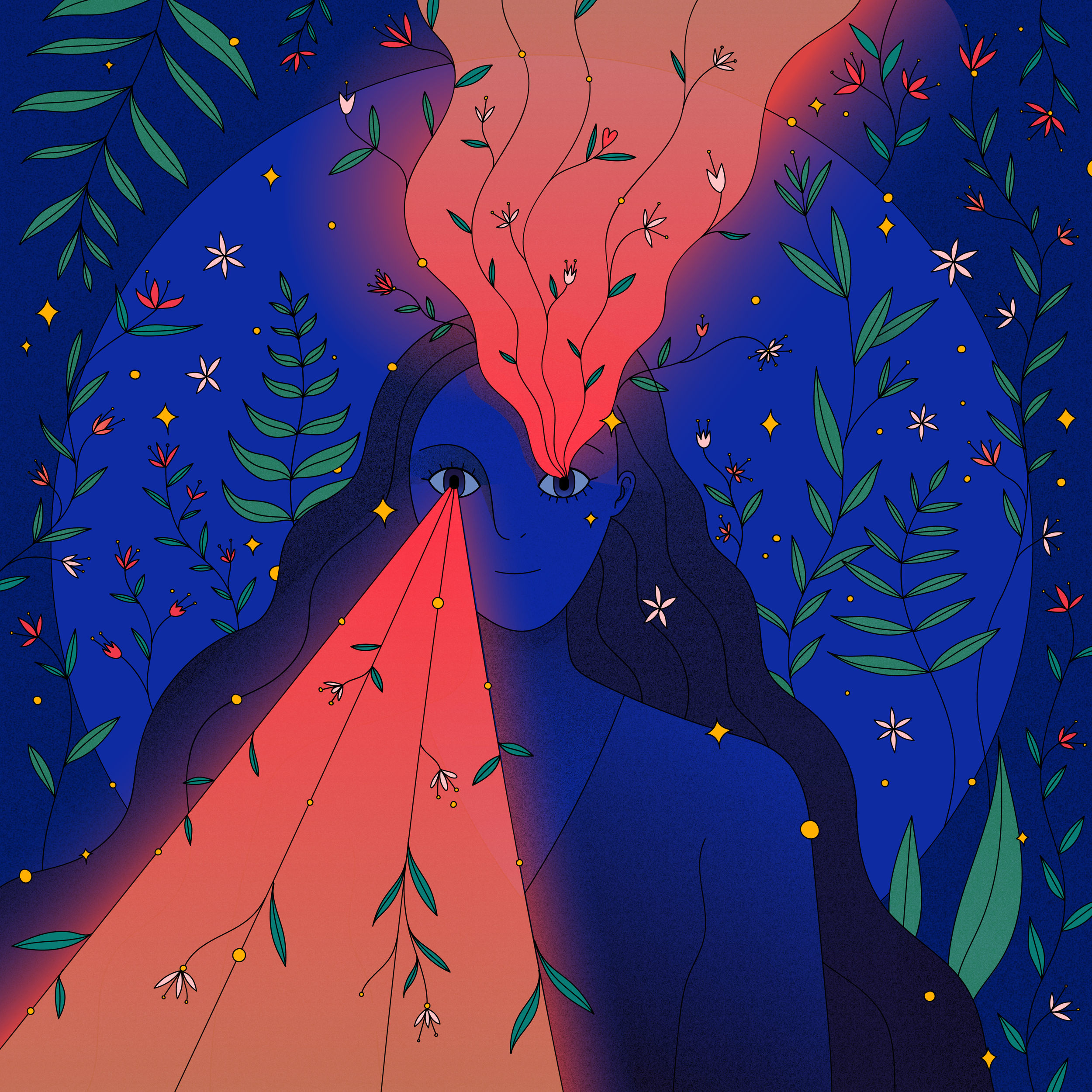
I was selected as a 2020 Adobe Creative Residency Community Fund recipient and was commissioned to create an illustration using the Adobe Illustrator app for the iPad.
"Through Her Eyes" is a whimsical portrait of a girl depicting her potential creativity shooting out of her eyes. I wanted to create a quirky and fun illustration featuring imagery that inspires me daily, such as flowers and stars.
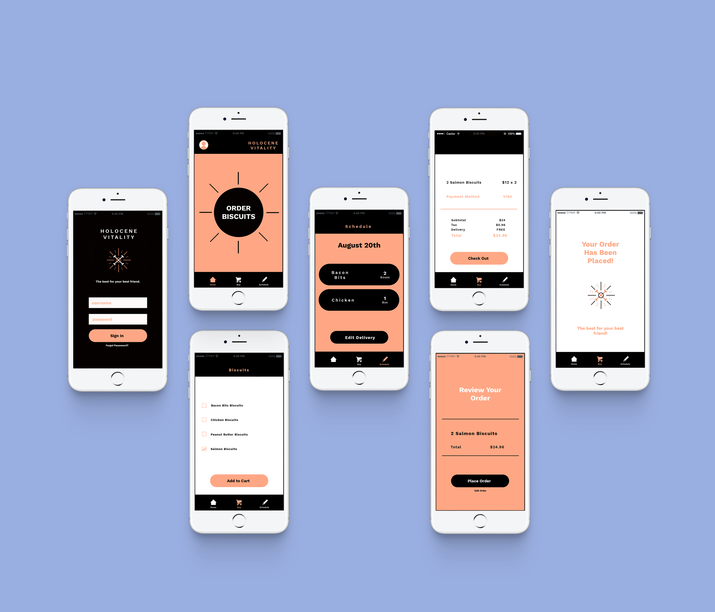
Holocene Vitality is a conceptual dog biscuit brand that is designed with a paleontological twist. I created this while I was a design student. The branding reflects a sophisticated product that will appeal to paleontologists who want to feed their best friends quality biscuits that also ties into their life's work.
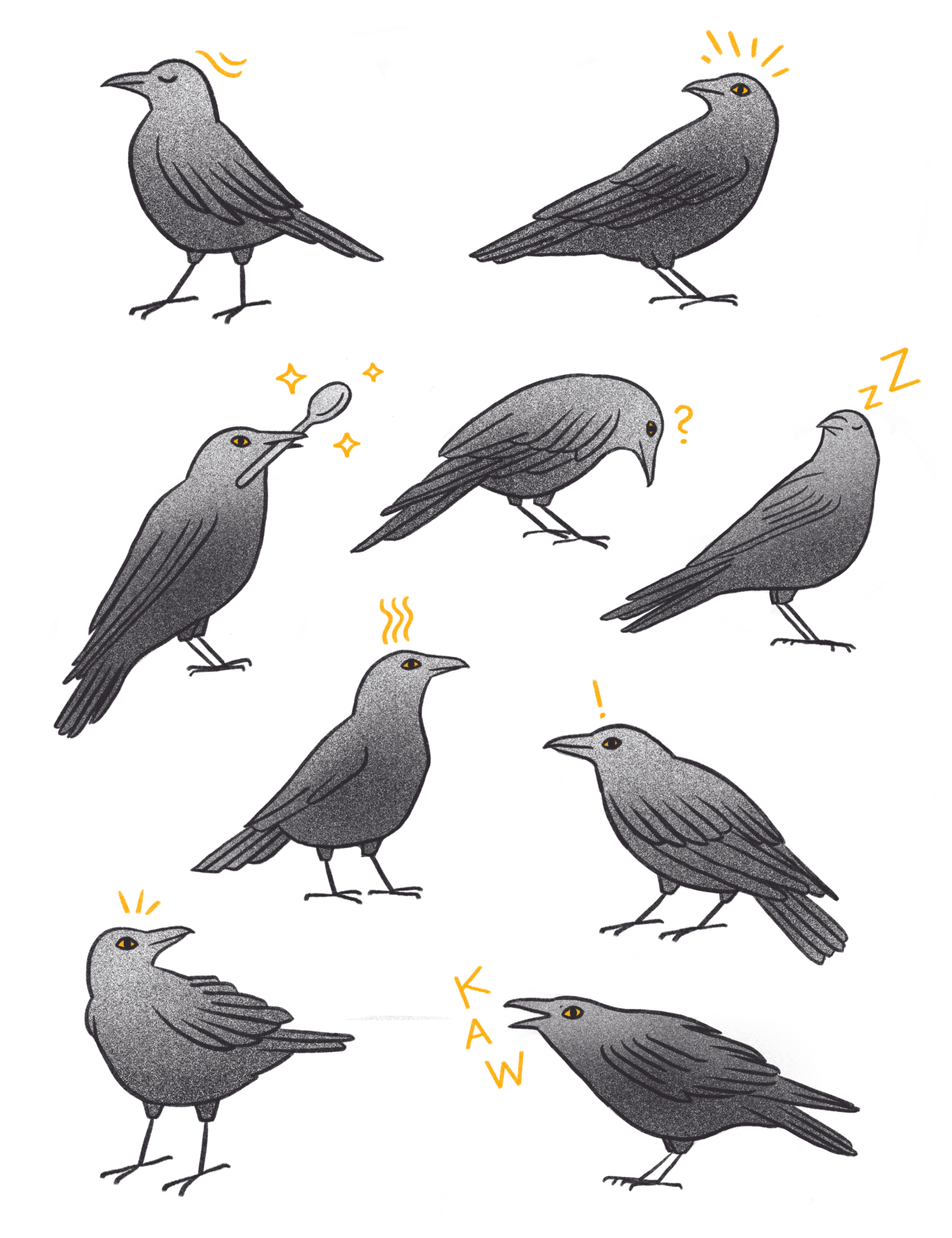
I love crows, so I created a fun iMessage sticker pack using my crow illustrations. I focused on capturing their personality through small, expressive moments that feel playful and easy to use in everyday conversations.
The Crow Bro Sticker Pack is available as a free download on the App Store.
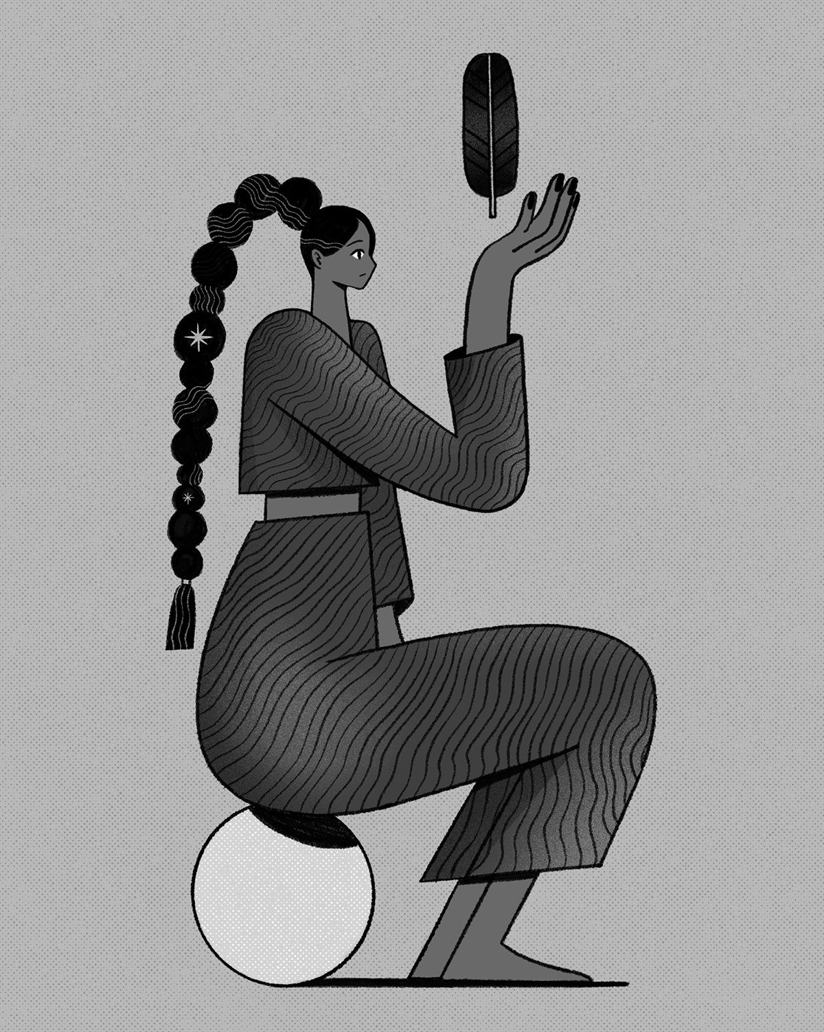
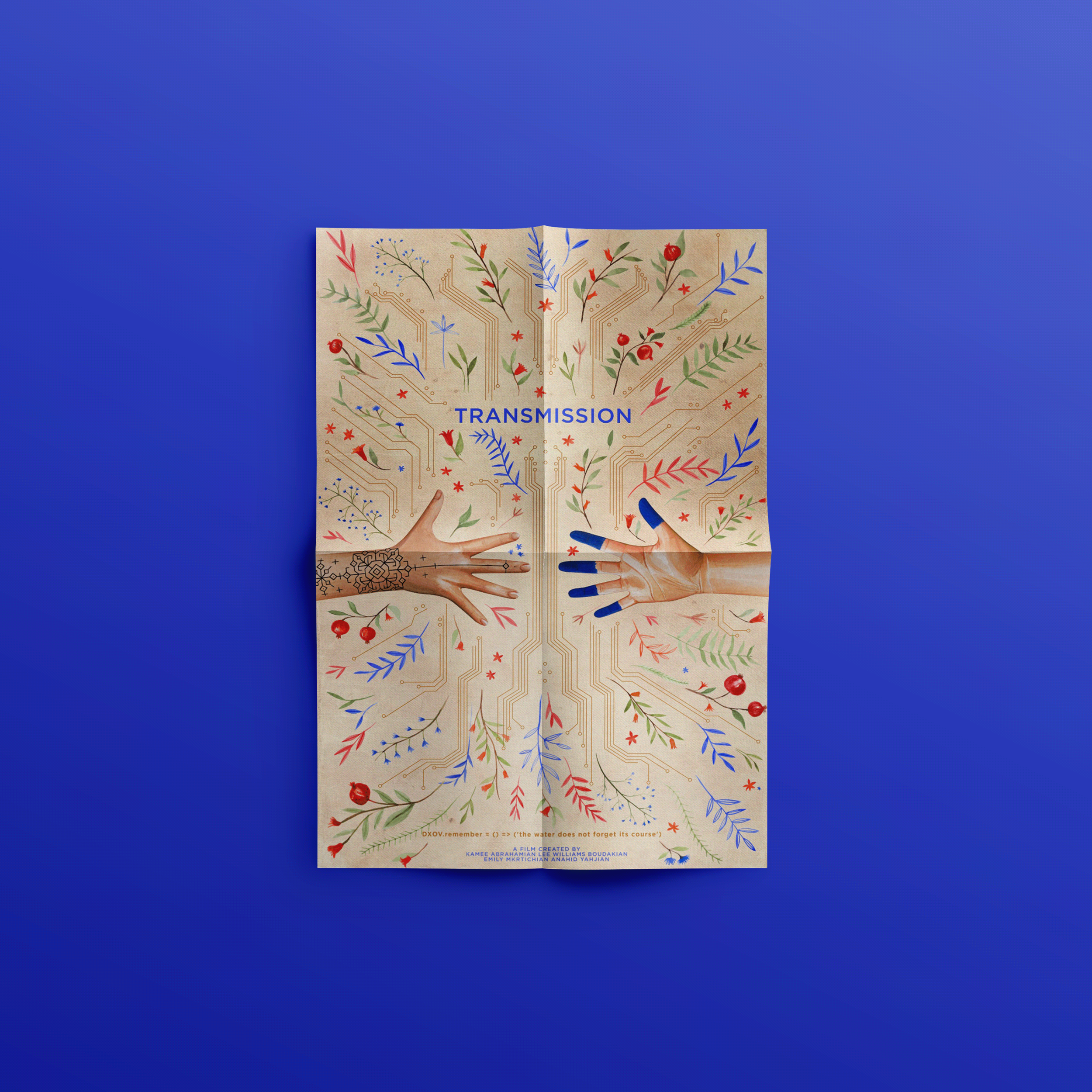
Transmission is a film about K and L, two cultural conservations working in a not-so-distant future to preserve artifacts and histories that are being systematically destroyed by a totalitarian government. When they are in a deadly car accident, time splinters into parallel realities, separating them. Each enters a reality where one dies while the other lives and they embark on a search between worlds to find each other again.
The story explores the dualtity between analog and digital, between technology and ancient knowledge. The symmetrical composition reflects on the precision of modern technology, while the hand painted, organic elements draw from the style and colors of Armenian illuminated manuscripts, which evoke the cultural heritage of the two protagonists. The imagery is created using water colors.
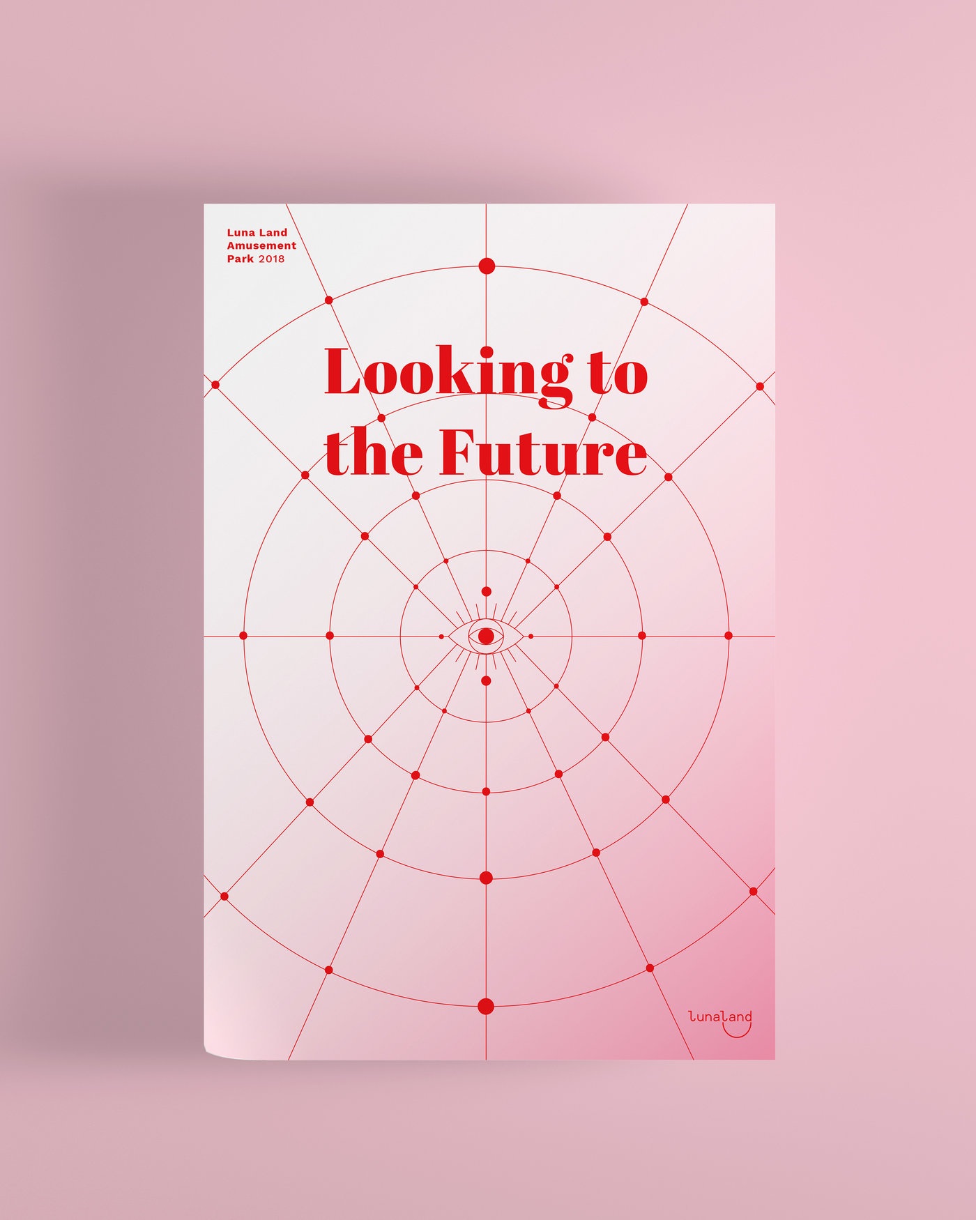
Looking to the Future is a conceptual microsite created as a school project for Luna Land Amusement Park’s annual corporate report. The design pairs a clean and minimal layout with playful visual elements to reflect a company that balances professionalism with some fun.
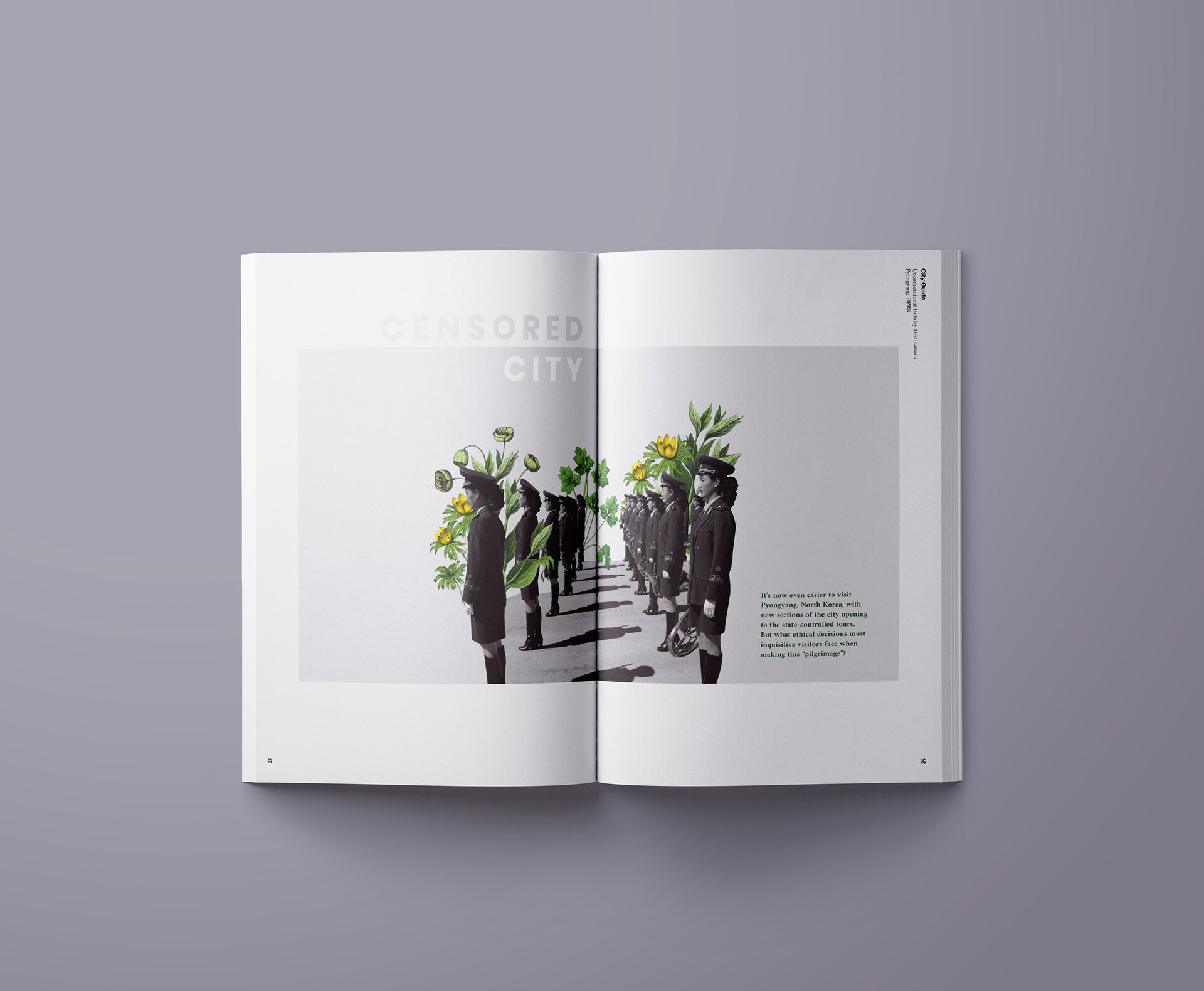
Censored City is a conceptual editorial spread designed for Wanderer Magazine, a fictional magazine that explores unconventional travel destinations through a counter-culture lens. The magazine’s tone is nonconformist and curious and tries to look beyond typical travel narratives.
For the North Korea feature, I focused on creating a mood that reflects both the eerie stillness of Pyongyang and the surreal nature of how it is often viewed from the outside. The black and white image treatment sets a stark and restrained toned while the collaged floral illustrations add warmth and softness, that isn’t grounded in reality, but instead feels dissonant and dreamlike.